Writing

Review ·

Pebble Time 2 review

This is my review of the Pebble Time 2, as a previous user of Apple Watch (series 9) with an iPhone and Pixel Watch (series 4) with a Pixel.

A photo of Jonothan sitting outdoors on a sunny day wearing a Pebble Time 2 on one wrist and a Fitbit on the other

Background

A couple of years back, I got an Apple Watch for the fitness rings, the notifications, and I like a good gadget. It of course fit seamlessly in with the other Apple devices I use, and it worked flawlessly, though charging daily was a little annoying.

When the Pixel 10 came out, I hopped over to it and the Pixel Watch 4. It’s not quite as seamless as Apple’s ecosystem, but Android delivers more personality, and importantly for me: customisation. Thousands of watchfaces and the ability to add my own.

I was 16 when the first Pebble Time came out, but wistful mentions in tech publications and Linus on the WAN Show meant that when Eric Migicovsky posted about bringing the Pebble back, I preordered one right away.

Notifications, calendar, 2 week+ battery, e-paper display, open source everything. Sounds perfect.

And… it delivers!

Battery

A month ago my Pebble arrived. I charged it to full, charged once again since and today I’m on 60% battery. I believe Core Devices are aiming for even better battery life, but 2 weeks is pretty good and the little charging puck keyring is a good way not to lose a dongle you’ll be using only once or twice a month!
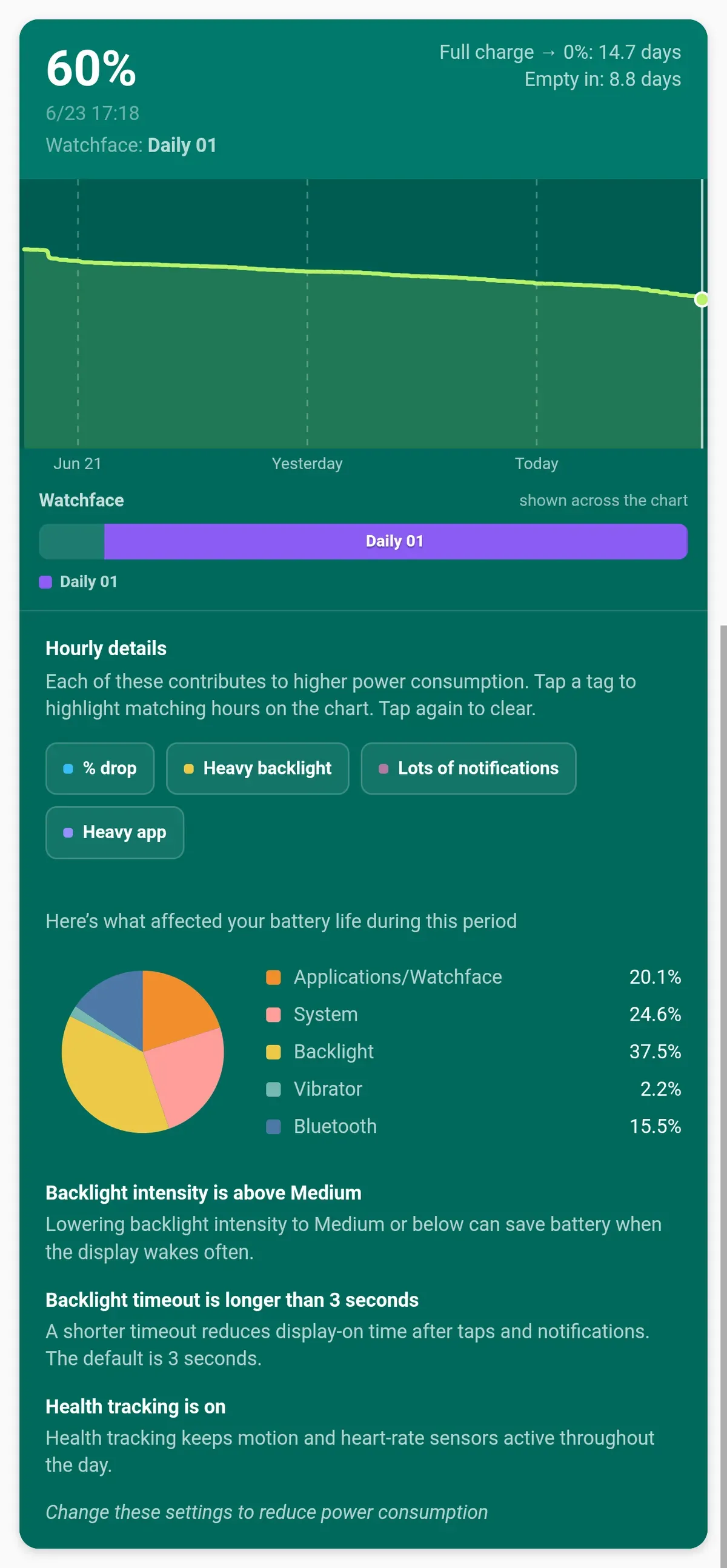
A screenshot of a detailed battery stats app for the Pebble showing 60% remaining with a projected 14.7 days of full charge life, along with a pie chart breaking down power consumption by backlight, system, and watchface.

Health

The Pebble Time 2 features heart rate, step, and sleep tracking, which are fine, except I’m a bit of a nerd and quite like the in-depth data I was getting from the Apple / Pixel watches.

Whilst Pebble integrates nicely with Google Health via Health Connect on Android and provides basic step and sleep tracking, I found the stats not to be particularly accurate at times, and regardless wanted more in-depth stats.

And perfect timing: Google brought out the Fitbit Air, a screenless band which lasts weeks on a charge, and which I’ve been wearing alongside the watch for the last 3 weeks.
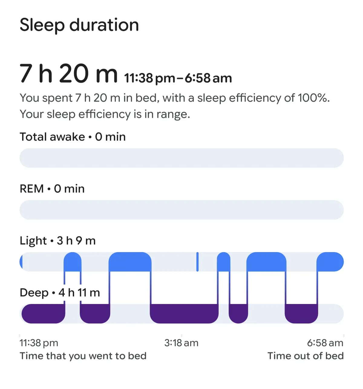
A screenshot showing Pebble's sleep data inside Google Health, showing very basic tracking of only light and deep sleep stages. This is data from a night where Pebble tracked my sleep. It missed me waking up for a while during that night.
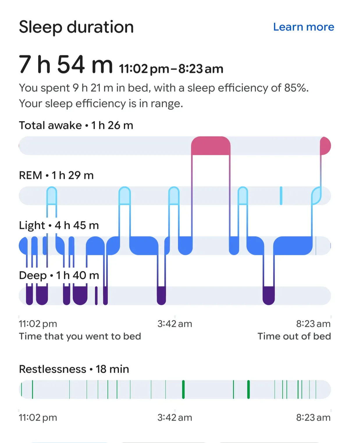
A screenshot of Fitbit's sleep tracking in Google Health, showing detailed sleep stages including REM, light, deep, and awake times, along with restlessness data. And a day where FitBit tracked my sleep

But I wanted my stats to sync to the watch and get the same rings experience I enjoyed on the previous watches, and I wanted a watchface designed to feel like my other projects like the personal AI/tasks/notes app I made for myself:
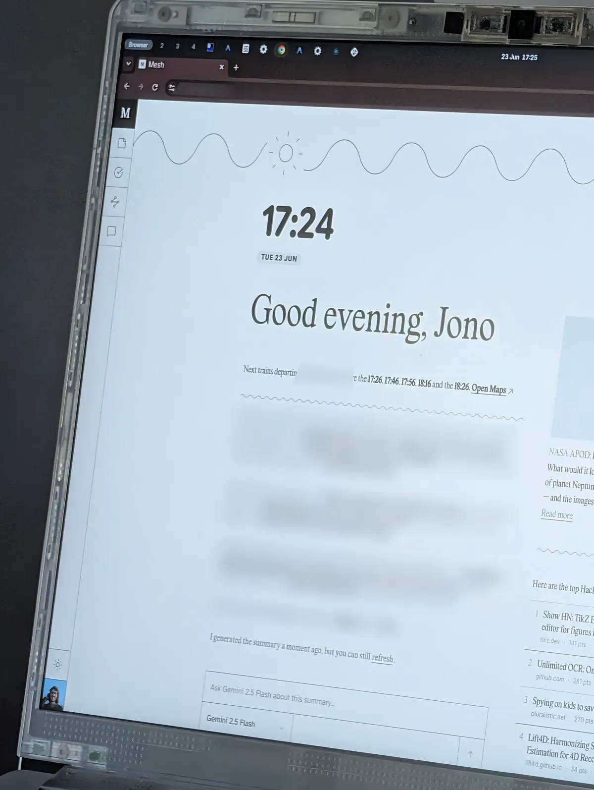
A laptop screen displaying a custom web app named Mesh with a clean design, a greeting, and a prompt box for Gemini 2.5 Flash.

Tinkering

…and you can just do that. In fact, Core Devices even released a skill which gives an agent everything needed to help you build a watchface.
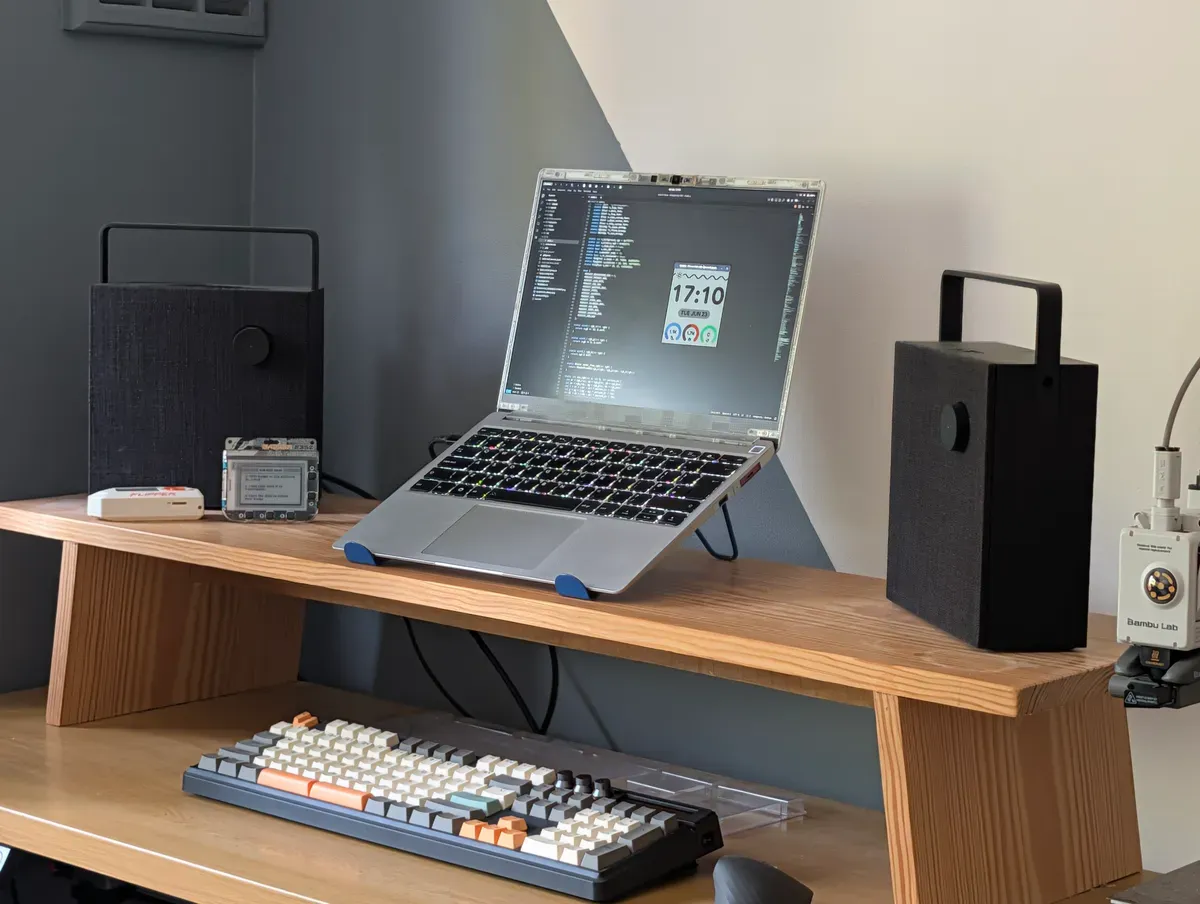
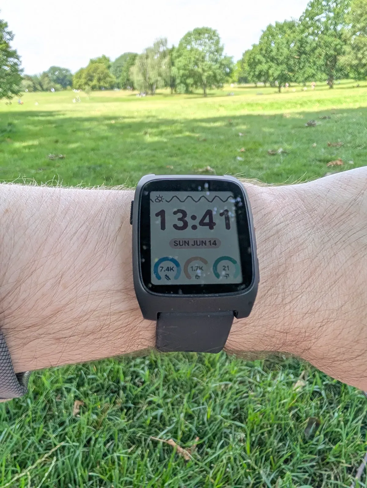
A desk setup featuring a Framework laptop on a wooden stand displaying a Pebble watchface emulator and code editor, flanked by two black speakers and a mechanical keyboard

My custom watchface on the Pebble Time 2

I’m just thrilled with this one I made! I even checked the battery usage, thinking perhaps my watchface and syncing would cause increased drain on phone or watch. And no; still going at the same rate!

PebbleOS

PebbleOS brings me so much joy. To me it’s the perfect balance of functionality and personality.

Compared to Google’s WearOS and Apple’s WatchOS, despite the fun transitions and animations, there’s virtually no waiting for anything.

Of course, there’s significantly less happening on a Pebble, but if, like me, all you’re after is great watchfaces, notifications, smart alarms, and a timeline (more on that in a moment), the Pebble doesn’t just cover them, it’s even FASTER; menus and apps open instantly, and notifications arrive as soon as they do on my phone.

The timeline is a feature I didn’t know I wanted. The bottom button is preset to open the timeline (instantly!) which lists everything coming up in all my calendars. Sounds simple, but even WearOS doesn’t natively support some work calendars e.g. Google Workspace and Outlook correctly, and opening calendar on both Apple and Google watches is STILL not as clean and fast as the timeline on the Pebble.
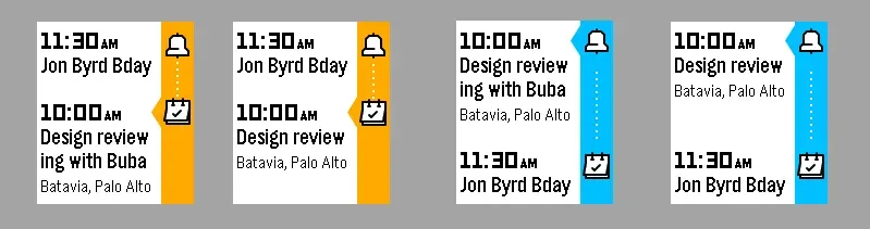
A digital rendering of the Pebble Timeline UI showing an upcoming meeting Image credit: Thomas Stoeckert

Overall the UX and UI are so thoughtful and I’ve not found myself frustrated by the form-over-function choices latent in other smartwatch OSs, and yet the Pebble has so much more personality!

There’s a very extensive collection of old and new watchfaces in the Pebble store, and some fun apps too!
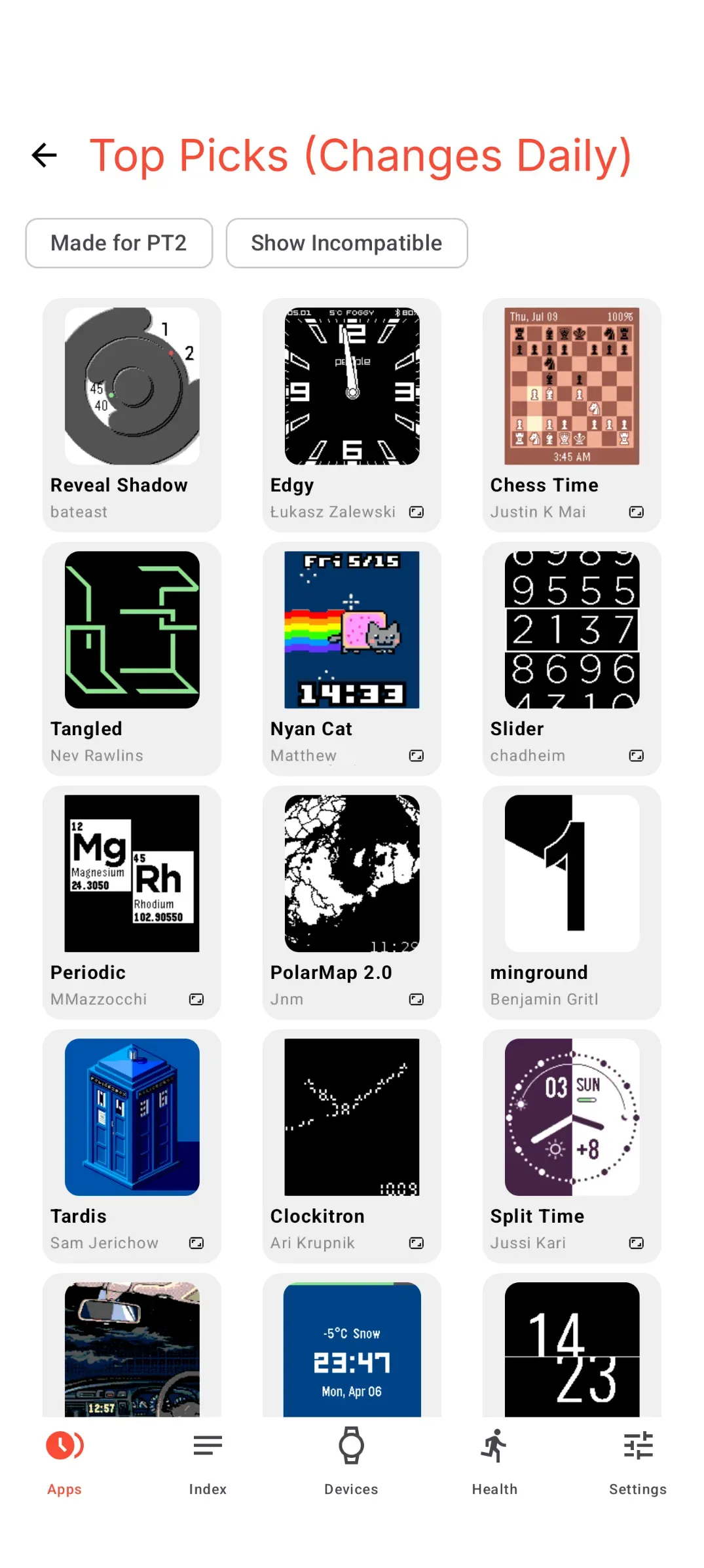
A screenshot of the Pebble app showing a grid of various custom watchfaces in the Top Picks section

Hardware

I admit when Eric announced some design changes on his podcast and blog, I wasn’t all that excited, however in person, my Pebble looks and feels great. It’s solid, the buttons are grippy and satisfying and it’s a good size.

The screen is dimmer/less reflective than I expected compared to some e-ink displays I’ve used in the past (the Pebble’s screen is e-paper and technically a Sharp Memory LCD). However it’s definitely not unreadable and the customisable backlight does a more than good enough job at night.

The colours on the screen are more vibrant than I expected. And the refresh rate is WAY better too, coming from tinkering with e-ink screens.

Touch support has recently become possible to add to apps, and I’ve seen some cool examples like this World Cup 2026 one:
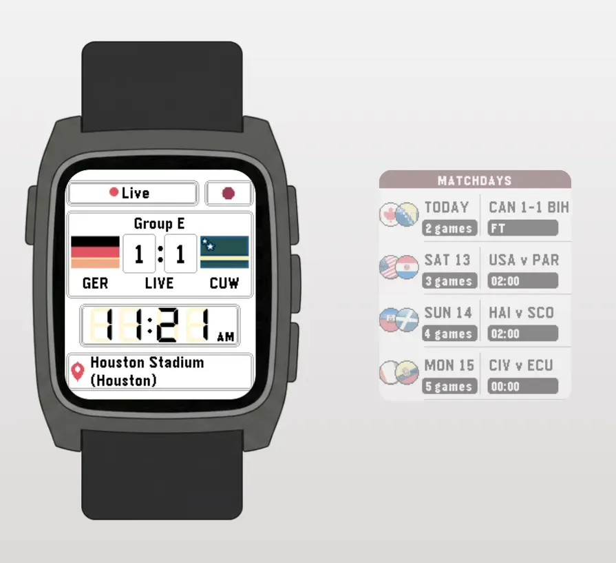
A screenshot of the World Cup 2026 app for Pebble showing a match and an interactive touch slider

As for bands, it’s cool that the Pebble uses standard 22mm quick release pins, of which there are countless options everywhere.

Comfort

The watch itself is very comfortable. I even initially forgot to add a comment on comfort becasue I didn’t even notice it! Feels light on the wrist. I am however, looking forward to getting a band more similar to the Apple braided selection which I enjoyed.

Price

The Pebble Time 2 cost me £185 ($250) + a follow up £40 ($53), so it’s not cheap, but it compares very favourably to my previous smartwatches. For what it is, I’d say excellent value.

Potential downsides

The Core Devices site says:

This project is a labour of love rather than a startup trying to sell millions of watches. There may be some rough edges (literally).

…for me there actually haven’t been aside from the occasional voice transcription failing when replying to messages and health tracking not being up to scratch with big tech’s fancy sensors and machine learning (duh!).

I hear iOS is not quite as friendly with 3rd party watches, even with the EU encouraging a level of parity e.g. for passing notifications and so on to the watch, so that might be something to check.

There are some features that in my dream world, I’d carry over from previous watches:

  1. The aforementioned better health tracking and more sensors (GPS, Blood Oxygen and so on)

  2. Music playback with a direct Bluetooth connection to earbuds (I have to bring my phone when out if I want to listen to music)

  3. NFC Payments

Of course to varying extents, these are the trade-offs being made for such great battery life and so on.

Overall

I love being able to tinker with a good gadget. Even better when it’s open source. It’s rare those things happen and the product is as good as, if not better than the big guys’.

I’m writing this on a Framework laptop which has delivered on a similar promise.

Good tech is back!
SITE ·

Creative Tech Stack

SITE ·

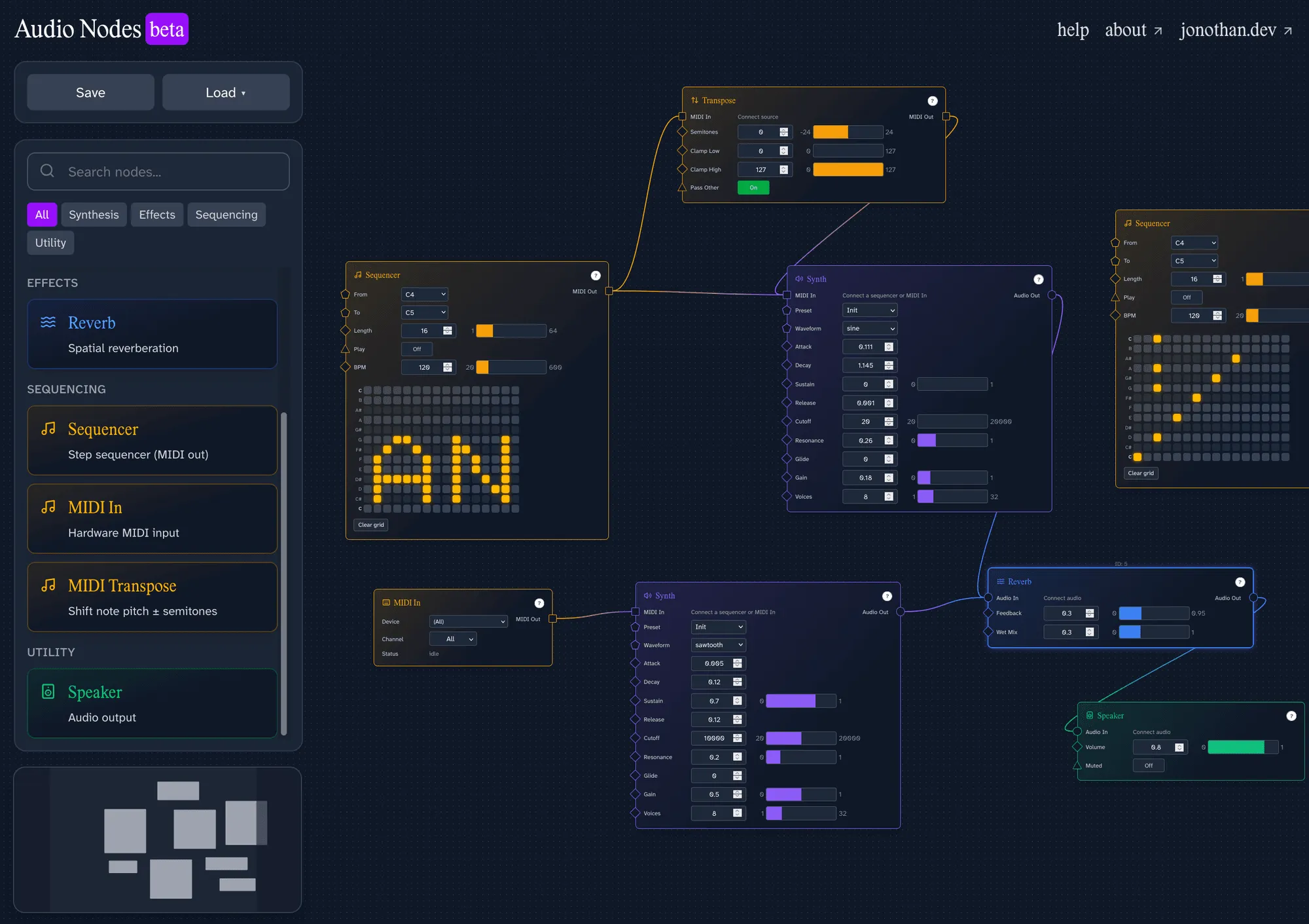
Audio Nodes — a node-based app for making audio

This is Audio Nodes!

Audio Nodes screenshot

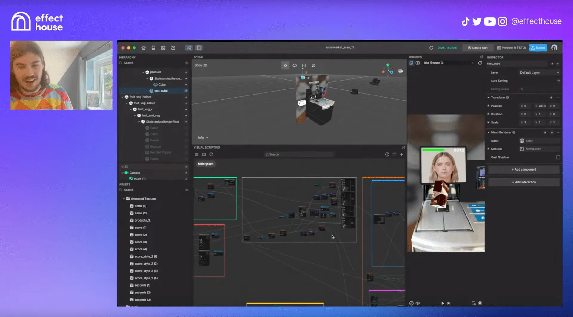
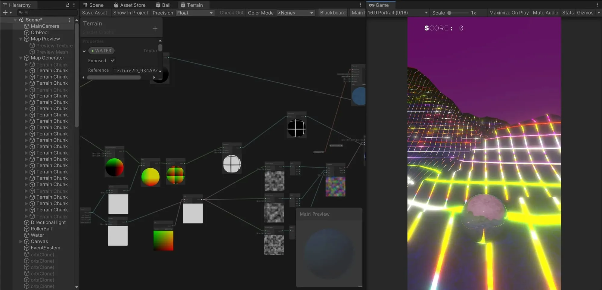
Node-based programming was my entry into coding, and I still prefer nodes for creative workflows, like TouchDesigner, TikTok’s Effect House, Unity’s Shadergraph being some of my favourites.

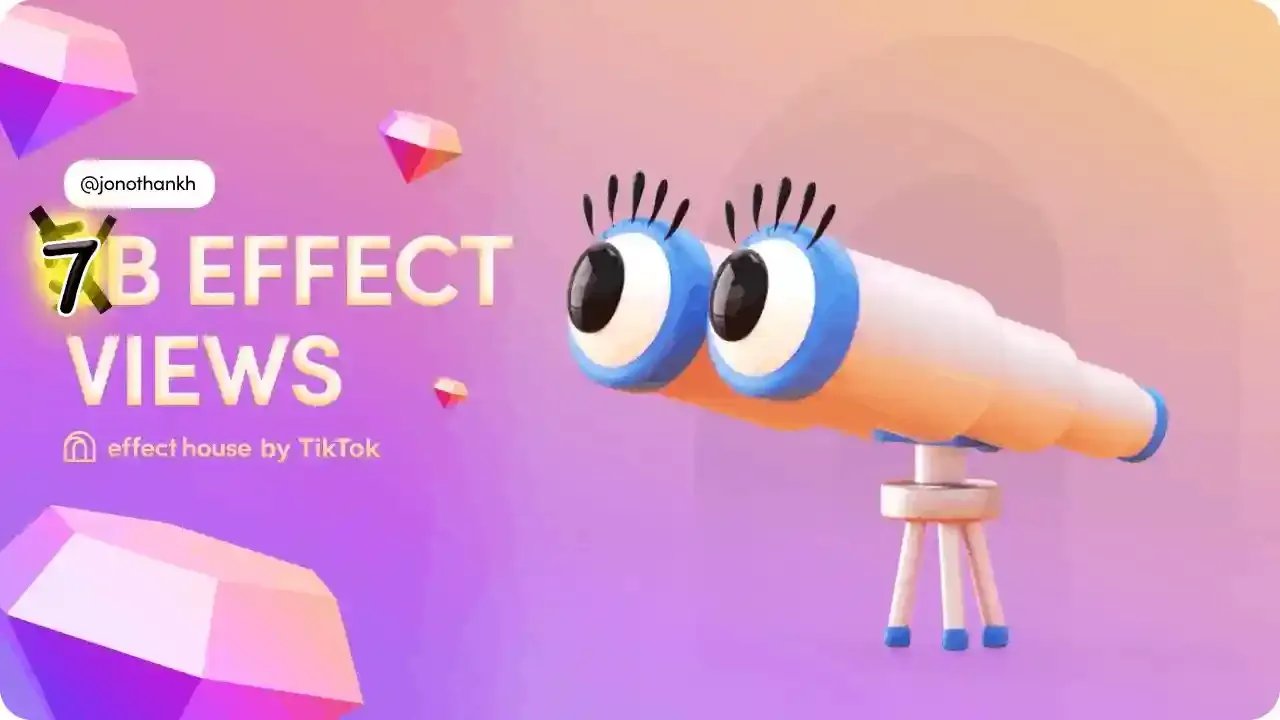
TikTok Effect House screenshot from live stream TikTok Effect House live stream with the amazing Celine

Unity shader graph The Unity shader graph (such good times)
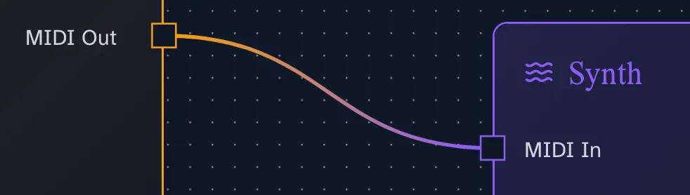
I’ve been meaning to make my own node-based thing and ALSO try my hand at (Web Assembly (WASM))[https://webassembly.org/]. As a musician, what better way to combine both goals than by making an audio app with a node-based interface and Rust for the audio processing!

Fortunately for me, there exists a wonderful library called React Flow made by the xyflow team, which gives you the basics like draggable nodes, wires and a canvas.

From there, with some help from AI, I made an audio engine, and the architecture for making new nodes.

The modular nature of nodes in this project means I can learn Rust & WASM techniques in small chunks as I attempt to get my head around them.

If you’re interested in the technical side of things, check out the project README.

Audio Nodes screenshot I love styling my projects, and little touches like blending the wire colours between nodes have been so fun to make!

I plan to keep adding nodes (there’s a todo list in the project README) as I learn Rust and WASM!

Let me know if you’ve any ideas hey@jonothan.dev

Post · SITE · Code ·

Progressive blur on the web

A quick demo and explanation of how to create a progressive blur effect using only CSS.

Progressive blur is all the rage.

But I’m not a fan of how I usually see it implemented on the web.

Have a scroll in this example:

<!DOCTYPE html>
<html lang="en">
  <head>
    <meta charset="UTF-8" />
    <meta name="viewport" content="width=device-width, initial-scale=1.0" />
    <title>Progressive Blur with Scroll Fade</title>

    <link rel="stylesheet" href="styles.css" />

    <style>
      /* Progressive blur header: stacked strips with increasing blur and gradient masks */
      .blur-header {
        width: 100%;
        height: 100%;
        position: absolute;
        top: 0;
        left: 0;
        overflow: hidden;
      }
      .strips-container {
        display: flex;
        flex-direction: column;
        height: 100%;
      }
      .strip {
        height: 20px;
      }
      .strip:nth-child(1) {
        height: 60px;
        backdrop-filter: blur(8px);
        -webkit-backdrop-filter: blur(8px);
      }
      .strip:nth-child(2) {
        backdrop-filter: blur(4.5px);
        -webkit-backdrop-filter: blur(4.5px);
      }
      .strip:nth-child(3) {
        backdrop-filter: blur(4px);
        -webkit-backdrop-filter: blur(4px);
      }
      .strip:nth-child(4) {
        backdrop-filter: blur(3.5px);
        -webkit-backdrop-filter: blur(3.5px);
      }
      .strip:nth-child(5) {
        backdrop-filter: blur(3px);
        -webkit-backdrop-filter: blur(3px);
      }
      .strip:nth-child(6) {
        backdrop-filter: blur(2.5px);
        -webkit-backdrop-filter: blur(2.5px);
      }
      .strip:nth-child(7) {
        backdrop-filter: blur(2px);
        -webkit-backdrop-filter: blur(2px);
      }
      .strip:nth-child(8) {
        backdrop-filter: blur(1.5px);
        -webkit-backdrop-filter: blur(1.5px);
      }
      .strip:nth-child(9) {
        backdrop-filter: blur(1px);
        -webkit-backdrop-filter: blur(1px);
      }
      .strip:nth-child(10) {
        backdrop-filter: blur(0.5px);
        -webkit-backdrop-filter: blur(0.5px);
      }
      .mask {
        -webkit-mask-image: linear-gradient(
          to bottom,
          transparent 0%,
          black 25%,
          black 70%,
          transparent 100%
        );
        mask-image: linear-gradient(
          to bottom,
          transparent 0%,
          black 25%,
          black 70%,
          transparent 100%
        );
      }
      .overlap {
        margin-top: -15px;
      }
      /* Simple blur with gradient mask (for comparison) */
      .bad-blur {
        width: 100%;
        height: 100%;
        backdrop-filter: blur(5px);
        -webkit-backdrop-filter: blur(10px);
        -webkit-mask-image: linear-gradient(to bottom, black 0%, black 40%, transparent 100%);
        mask-image: linear-gradient(to bottom, black 0%, black 40%, transparent 100%);
      }
    </style>
  </head>
  <body>
    <div class="header-divider"></div>
    <div class="header-comparison">
      <div class="header-half">
        <div class="blur-header">
          <div class="strips-container">
            <div class="strip"></div>
            <div class="strip mask overlap"></div>
            <div class="strip mask overlap"></div>
            <div class="strip mask overlap"></div>
            <div class="strip mask overlap"></div>
            <div class="strip mask overlap"></div>
            <div class="strip mask overlap"></div>
            <div class="strip mask overlap"></div>
            <div class="strip mask overlap"></div>
            <div class="strip mask overlap"></div>
          </div>
        </div>
      </div>
      <div class="header-half">
        <div class="bad-blur"></div>
      </div>
    </div>

    <main class="content-container">
      <div class="content-inner">
        <h1>Progressive blur & fade</h1>
        <p>
          Left: progressive blur. Right: simple blur with mask. Scroll to compare the two approaches.
        </p>
        <!-- Example content below is unrelated to the blur technique -->
        <p>
          Lorem ipsum dolor sit amet, consectetur adipiscing elit. Sed non
          risus. Suspendisse lectus tortor, dignissim sit amet, adipiscing nec,
          ultricies sed, dolor. Cras elementum ultrices diam. Maecenas ligula
          massa, varius a, semper congue, euismod non, mi. Proin porttitor, orci
          nec nonummy molestie, enim est eleifend mi, non fermentum diam nisl
          sit amet erat.
        </p>
        <p>
          Duis semper. Duis arcu massa, scelerisque vitae, consequat in, pretium
          a, enim. Pellentesque congue. Ut in risus volutpat libero pharetra
          tempor. Cras vestibulum bibendum augue. Praesent egestas leo in pede.
          Praesent blandit odio eu enim. Pellentesque sed dui ut augue blandit
          sodales. Vestibulum ante ipsum primis in faucibus orci luctus et
          ultrices posuere cubilia Curae; Aliquam nibh.
        </p>
        <p>
          Mauris ac mauris sed pede pellentesque fermentum. Maecenas adipiscing
          ante non diam. Sorbi in harami, man. Cras dolor dolor, tempus hon,
          dapibus, vel, orci. Praesent dapibus. Aenean id metus id velit
          ullamcorper pulvinar. Vestibulum fermentum tortor id mi. Pellentesque
          ipsum. Nulla ac enim. In tempor, turpis nec euismod scelerisque, quam
          turpis adipiscing lorem, vitae mattis nibh ligula nec sem.
        </p>
      </div>
    </main>
  </body>
</html>

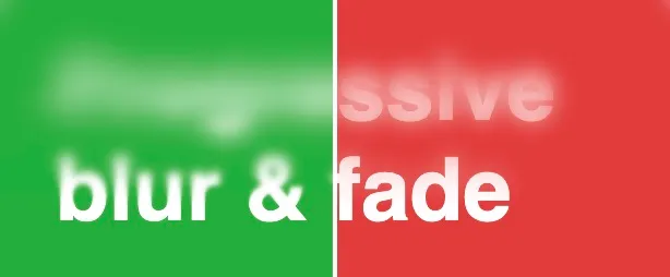
See the lovely progressive blur on the left?

image render of progressive backdrop blur on the left and a simpler blur with mask over the top

Why does it look better?

Because it actually progressively blurs the background, increasing the blur effect the higher it goes. The version on the right is just a blanket backdrop blur with a gradient mask.

Here’s how I made progressive blur with CSS:

Attempt 1: I thought, why not just stack lots of divs with increasing amounts of backdrop blur?

<!DOCTYPE html>
<html lang="en">
  <head>
    <meta charset="UTF-8" />
    <meta name="viewport" content="width=device-width, initial-scale=1.0" />
    <title>Progressive Blur with Scroll Fade</title>

    <link rel="stylesheet" href="styles.css" />

    <style>
      /* Simple progressive blur: stacked strips with increasing blur (no overlap or mask) */
      .blur-header {
        position: fixed;
        top: 0;
        left: 0;
        width: 100%;
        height: 100px;
        overflow: hidden;
        z-index: 10;
      }
      .strips-container {
        display: flex;
        flex-direction: column;
      }
      .strip {
        height: 15px;
        width: 100%;
      }
      .strip:nth-child(1) {
        backdrop-filter: blur(8px);
        -webkit-backdrop-filter: blur(8px);
      }
      .strip:nth-child(2) {
        backdrop-filter: blur(6.5px);
        -webkit-backdrop-filter: blur(6.5px);
      }
      .strip:nth-child(3) {
        backdrop-filter: blur(5px);
        -webkit-backdrop-filter: blur(5px);
      }
      .strip:nth-child(4) {
        backdrop-filter: blur(3.5px);
        -webkit-backdrop-filter: blur(3.5px);
      }
      .strip:nth-child(5) {
        backdrop-filter: blur(2px);
        -webkit-backdrop-filter: blur(2px);
      }
      .strip:nth-child(6) {
        backdrop-filter: blur(1.5px);
        -webkit-backdrop-filter: blur(1.5px);
      }
      .strip:nth-child(7) {
        backdrop-filter: blur(1px);
        -webkit-backdrop-filter: blur(1px);
      }
      .strip:nth-child(8) {
        backdrop-filter: blur(0.5px);
        -webkit-backdrop-filter: blur(0.5px);
      }
      .strip:nth-child(9) {
        backdrop-filter: blur(0.25px);
        -webkit-backdrop-filter: blur(0.25px);
      }
      .strip:nth-child(10) {
        backdrop-filter: blur(0px);
        -webkit-backdrop-filter: blur(0px);
      }
    </style>
  </head>
  <body>
    <!-- Simple progressive blur: stacked strips with increasing blur (no overlap or mask) -->
    <header class="blur-header">
      <div class="strips-container">
        <div class="strip"></div>
        <div class="strip"></div>
        <div class="strip"></div>
        <div class="strip"></div>
        <div class="strip"></div>
        <div class="strip"></div>
        <div class="strip"></div>
        <div class="strip"></div>
        <div class="strip"></div>
        <div class="strip"></div>
      </div>
    </header>

    <main class="content-container">
      <div class="content-inner">
        <h1>Progressive blur & fade</h1>
        <p>
          This is a basic progressive blur: stacked strips with increasing blur, no overlap or mask. Bands may appear between layers.
        </p>
        <!-- Example content below is unrelated to the blur technique -->
        <p>Lorem ipsum dolor sit amet, consectetur adipiscing elit. Sed non risus. Suspendisse lectus tortor, dignissim sit amet, adipiscing nec, ultricies sed, dolor. Cras elementum ultrices diam. Maecenas ligula massa, varius a, semper congue, euismod non, mi. Proin porttitor, orci nec nonummy molestie, enim est eleifend mi, non fermentum diam nisl sit amet erat.</p>
        <p>Duis semper. Duis arcu massa, scelerisque vitae, consequat in, pretium a, enim. Pellentesque congue. Ut in risus volutpat libero pharetra tempor. Cras vestibulum bibendum augue. Praesent egestas leo in pede. Praesent blandit odio eu enim. Pellentesque sed dui ut augue blandit sodales. Vestibulum ante ipsum primis in faucibus orci luctus et ultrices posuere cubilia Curae; Aliquam nibh.</p>
        <p>Mauris ac mauris sed pede pellentesque fermentum. Maecenas adipiscing ante non diam. Cras dolor dolor, tempus hon, dapibus, vel, orci. Praesent dapibus. Aenean id metus id velit ullamcorper pulvinar. Vestibulum fermentum tortor id mi. Pellentesque ipsum. Nulla ac enim. In tempor, turpis nec euismod scelerisque, quam turpis adipiscing lorem, vitae mattis nibh ligula nec sem.</p>
      </div>
    </main>
  </body>
</html>

It looks cool, but the clear difference between the blur levels isn’t the smooth progressive blur we’re after.

Attempt 2: Overlap them and give each one a gradient mask:

<!DOCTYPE html>
<html lang="en">
  <head>
    <meta charset="UTF-8" />
    <meta name="viewport" content="width=device-width, initial-scale=1.0" />
    <title>Progressive Blur with Scroll Fade</title>

    <link rel="stylesheet" href="styles.css" />

    <style>
      /* Progressive blur header: stacked strips with increasing blur and gradient masks for smooth transition */
      .blur-header {
        position: fixed;
        top: 0;
        left: 0;
        width: 100%;
        height: 100px;
        overflow: hidden;
        z-index: 10;
      }
      .strips-container {
        display: flex;
        flex-direction: column;
      }
      .strip {
        height: 20px;
      }
      .strip:nth-child(1) {
        height: 60px;
        backdrop-filter: blur(8px);
        -webkit-backdrop-filter: blur(8px);
      }
      .strip:nth-child(2) {
        backdrop-filter: blur(4.5px);
        -webkit-backdrop-filter: blur(4.5px);
      }
      .strip:nth-child(3) {
        backdrop-filter: blur(4px);
        -webkit-backdrop-filter: blur(4px);
      }
      .strip:nth-child(4) {
        backdrop-filter: blur(3.5px);
        -webkit-backdrop-filter: blur(3.5px);
      }
      .strip:nth-child(5) {
        backdrop-filter: blur(3px);
        -webkit-backdrop-filter: blur(3px);
      }
      .strip:nth-child(6) {
        backdrop-filter: blur(2.5px);
        -webkit-backdrop-filter: blur(2.5px);
      }
      .strip:nth-child(7) {
        backdrop-filter: blur(2px);
        -webkit-backdrop-filter: blur(2px);
      }
      .strip:nth-child(8) {
        backdrop-filter: blur(1.5px);
        -webkit-backdrop-filter: blur(1.5px);
      }
      .strip:nth-child(9) {
        backdrop-filter: blur(1px);
        -webkit-backdrop-filter: blur(1px);
      }
      .strip:nth-child(10) {
        backdrop-filter: blur(0.5px);
        -webkit-backdrop-filter: blur(0.5px);
      }
      .mask {
        -webkit-mask-image: linear-gradient(
          to bottom,
          transparent 0%,
          black 25%,
          black 70%,
          transparent 100%
        );
        mask-image: linear-gradient(
          to bottom,
          transparent 0%,
          black 25%,
          black 70%,
          transparent 100%
        );
      }
      .overlap {
        margin-top: -15px;
      }
    </style>
  </head>
  <body>
    <!-- Progressive blur header: stacked strips with increasing blur and gradient masks -->
    <header class="blur-header">
      <div class="strips-container">
        <div class="strip"></div>
        <div class="strip mask overlap"></div>
        <div class="strip mask overlap"></div>
        <div class="strip mask overlap"></div>
        <div class="strip mask overlap"></div>
        <div class="strip mask overlap"></div>
        <div class="strip mask overlap"></div>
        <div class="strip mask overlap"></div>
        <div class="strip mask overlap"></div>
        <div class="strip mask overlap"></div>
      </div>
    </header>

    <main class="content-container">
      <div class="content-inner">
        <h1>Progressive blur & fade</h1>
        <p>
          As you scroll, the text below fades out at the top, passing under the progressive blur header above.
        </p>
        <!-- Example content below is unrelated to the blur technique -->
        <p>Lorem ipsum dolor sit amet, consectetur adipiscing elit. Sed non risus. Suspendisse lectus tortor, dignissim sit amet, adipiscing nec, ultricies sed, dolor. Cras elementum ultrices diam. Maecenas ligula massa, varius a, semper congue, euismod non, mi. Proin porttitor, orci nec nonummy molestie, enim est eleifend mi, non fermentum diam nisl sit amet erat.</p>
        <p>Duis semper. Duis arcu massa, scelerisque vitae, consequat in, pretium a, enim. Pellentesque congue. Ut in risus volutpat libero pharetra tempor. Cras vestibulum bibendum augue. Praesent egestas leo in pede. Praesent blandit odio eu enim. Pellentesque sed dui ut augue blandit sodales. Vestibulum ante ipsum primis in faucibus orci luctus et ultrices posuere cubilia Curae; Aliquam nibh.</p>
        <p>Mauris ac mauris sed pede pellentesque fermentum. Maecenas adipiscing ante non diam. Cras dolor dolor, tempus hon, dapibus, vel, orci. Praesent dapibus. Aenean id metus id velit ullamcorper pulvinar. Vestibulum fermentum tortor id mi. Pellentesque ipsum. Nulla ac enim. In tempor, turpis nec euismod scelerisque, quam turpis adipiscing lorem, vitae mattis nibh ligula nec sem.</p>
      </div>
    </main>
  </body>
</html>

That was easy!

This isn’t hugely performant (though you can optimize by using fewer, but larger, blur steps).

I did try some SVG filter effects, but those don’t tend to work so well on mobile.

For now though, this works—and it looks pretty cool!

Post ·

The best hot chocolate is £3.50 on an Uber boat

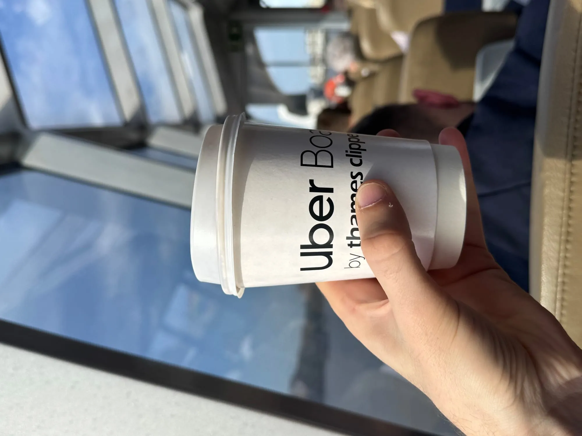
We all know water tastes better when you’ve been out in the heat, and I have to apply the same logic to Uber’s hot chocolate aboard Uber boats in London.

Me holding a hot chocolate on an Uber boat

So far as I can tell, they’re not special. Peaking behind the onboard café bar, it looks to me like your run-of-the-mill Cadbury stuff.

Me holding a hot chocolate on an Uber boat

But as someone who loves a fancy chocolate drink from places like Knoops, I am repeatedly surprised.

Uber boats are such a vibe. They do beer too if the surprisingly good hot chocolate is not your mood!

Oh and tap in and out with contactless/Oyster when you get there, no need to book online.

SITE · AI ·

A tool for ideation combining thinking frameworks with AI

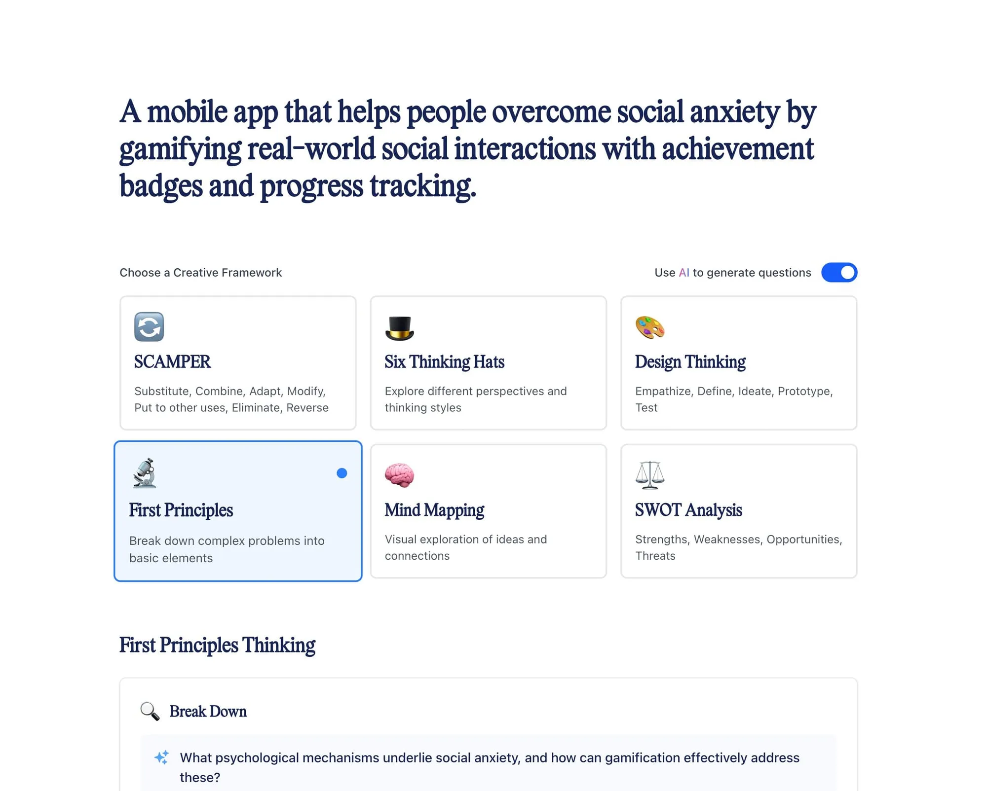
I made a site that combines thinking frameworks with AI to generate questions.

Sometimes, when developing an idea, especially a technical one, I use frameworks, like Edward de Bono’s Thinking Hats, the SCAMPER method or First Principles.

A few days ago I made a site which summarizes the steps involved in some common frameworks. As an experiment I implemented a cheap to run AI model which takes the summary of an idea you type in, and generates questions based on the steps of each framework.

Screenshot of the site showing the idea I put in and available frameworks. The idea is: A mobile app that helps people overcome social anxiety by gamifying real-world social interactions with achievement badges and progress tracking.

After typing in some ideas I’ve been working on, I was surprised at the quality of questions I was getting back, and I even received positive feedback from a few people I sent it too!

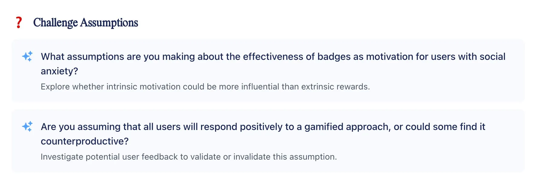
Challenge Assumptions: What assumptions are you making about the effectiveness of badges as motivation for users with social anxiety?  Explore whether intrinsic motivation could be more influential than extrinsic rewards.  Are you assuming that all users will respond positively to a gamified approach, or could some find it counterproductive?  Investigate potential user feedback to validate or invalidate this assumption.

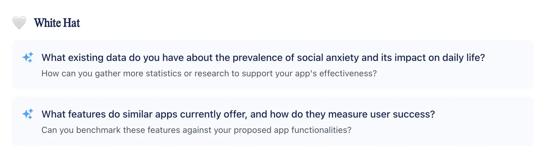
White Hat: What existing data do you have about the prevalence of social anxiety and its impact on daily life?  How can you gather more statistics or research to support your app's effectiveness?  What features do similar apps currently offer, and how do they measure user success?  Can you benchmark these features against your proposed app functionalities?

So far, I’ve especially valued the questioning of assumptions which I might not have immediately thought of even with the frameworks in front of me!

“You could just use ChatGPT/LLM!”

Sure! and I’ve made a few experiments involving direct ideation with AI, including multi-agent setups which each answer for specific parts of thinking frameworks, however I often enjoy a more manual process, and I think this combination of a basic UI with integrated AI for generating questions, is a nice balance!

How does it work?

It’s almost as simple as it looks! The prompt is sent to the model augmented with the idea typed in and selected framework, and we get structured questions back which get placed into the UI and also cached in local storage in the browser — so once questions are generated, switching between frameworks is fast, and we don’t ask the AI for the same thing twice!

Is the AI costing you?

A small amount, but nothing to worry about (for now 😆)

Feedback

I’d love any feedback! Please email me!

AR · TikTok Effects · Tutorial ·

What makes a viral TikTok game effect?

I’ve been making TikTok effects since Effect House (the software used to make TikTok effects) came out. This is what I’ve learnt so far:

1. Make it a challenge

I’ve found when creators can play the game and easily make their own challenge e.g. “I bet you can’t beat my score!?”, their followers are more likely to want to play too!

2. Keep it simple (sometimes)

Generally speaking, people making TikTok’s don’t have the bandwidth nor concentration span for understanding more than a basic mechanic.

So I usually go with simple face-based logic, like this horse staring contest…

Or tapping…

Or drawing…

3. Let creators to express themselves

Sounds obvious, I know. Creators wanna make more videos using your effect if you balance a fun game with a space for them to express themselves.

4. Luck

Of the (at time of writing) 8,952,605,076 views of TikToks using my effects, the top 10 account for about 8 billion.

I’ve made over 100 effects on TikTok, so only 10 of them have seen great ‘success’!

And sometimes, you spend no time at all making a stupid satisfying video parody effect, and it becomes part of a viral trend:

If that doesn’t emphasize the importance of luck, I don’t know what does.

Post ·

How to become a Creative Technologist for brands?

What is a Creative Technologist, and how do you become one?

First of all…

I don’t have wisdom as a 26-year-old.

If you want raw, brilliant creative development genius, I recommend checking out the likes of Bruno Simon, creator of beautiful 3D web experiences and the most incredible course in React Three Fiber: Three.js Journey, as well as Jen Simmons, a pioneer in web standards and layout design, instrumental in shaping CSS Grid and intrinsic web design. You might also explore Jeremy Keith, Yugo Nakamura, Porpentine Charity Heartscape, and Neal Agarwal.

In my sphere specifically, I look up to Perry Nightingale who leads Creative & AI at WPP, and Luke Hurd who is my far-improved counterpart in the US.

What is a Creative Technologist?

I’ve met Creative Technologists in manufacturing, design, media and other industries — and we’re all bridging a gap between creative vision, and development.

Where I work in advertising at VML, my team and I work together with creative, development, experience, design, data-science and other teams to ideate, prototype, develop and experiment.

What do we make?

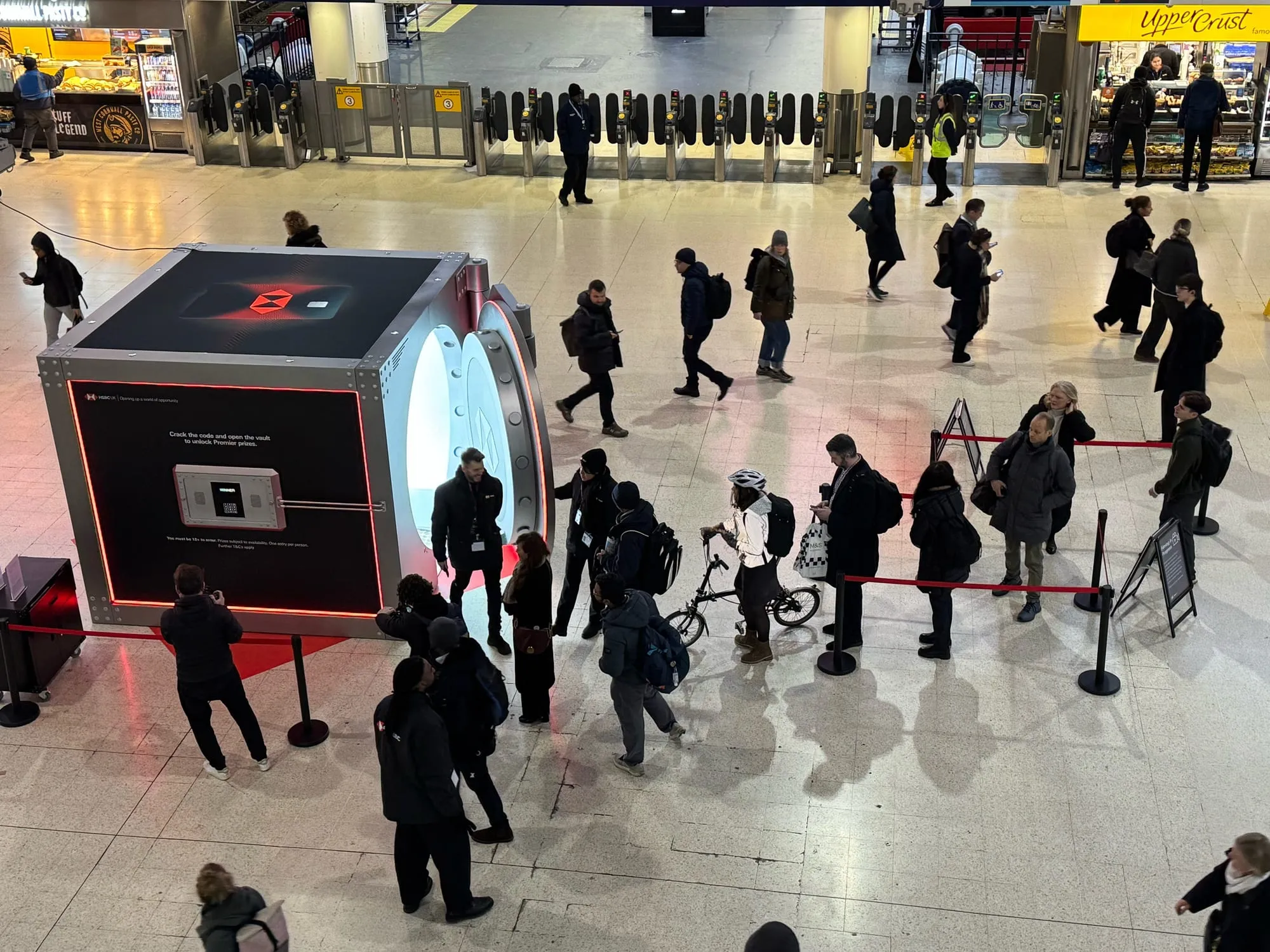
Depends where you’re working — recently we’ve developed WebAR experiences, worked on a mentorship app, and the software for an installations in London Waterloo station and Heathrow airport, run workshops, and a bunch of other stuff!

HSBC Vault experience in Waterloo

We have full native app and web teams in our business, so we tend to work on projects that require multiple and emerging technologies.

What do I need to become a Creative Technologist?

If you have a technical intuition relevant to the industry you’re entering and love building things, becoming a Creative Technologists mostly involves deciding you are one.

Beyond A-levels (nobody ever asked me about them) and online courses, I haven’t any formal qualifications, and I’m doing alright!

To better understand the industry, I took out a loan and attended the School of Communication Arts 2.0 in Brixton, which also gave me some great ideation techniques.

Me moving my real hands and having virtual hands moving in a poster!

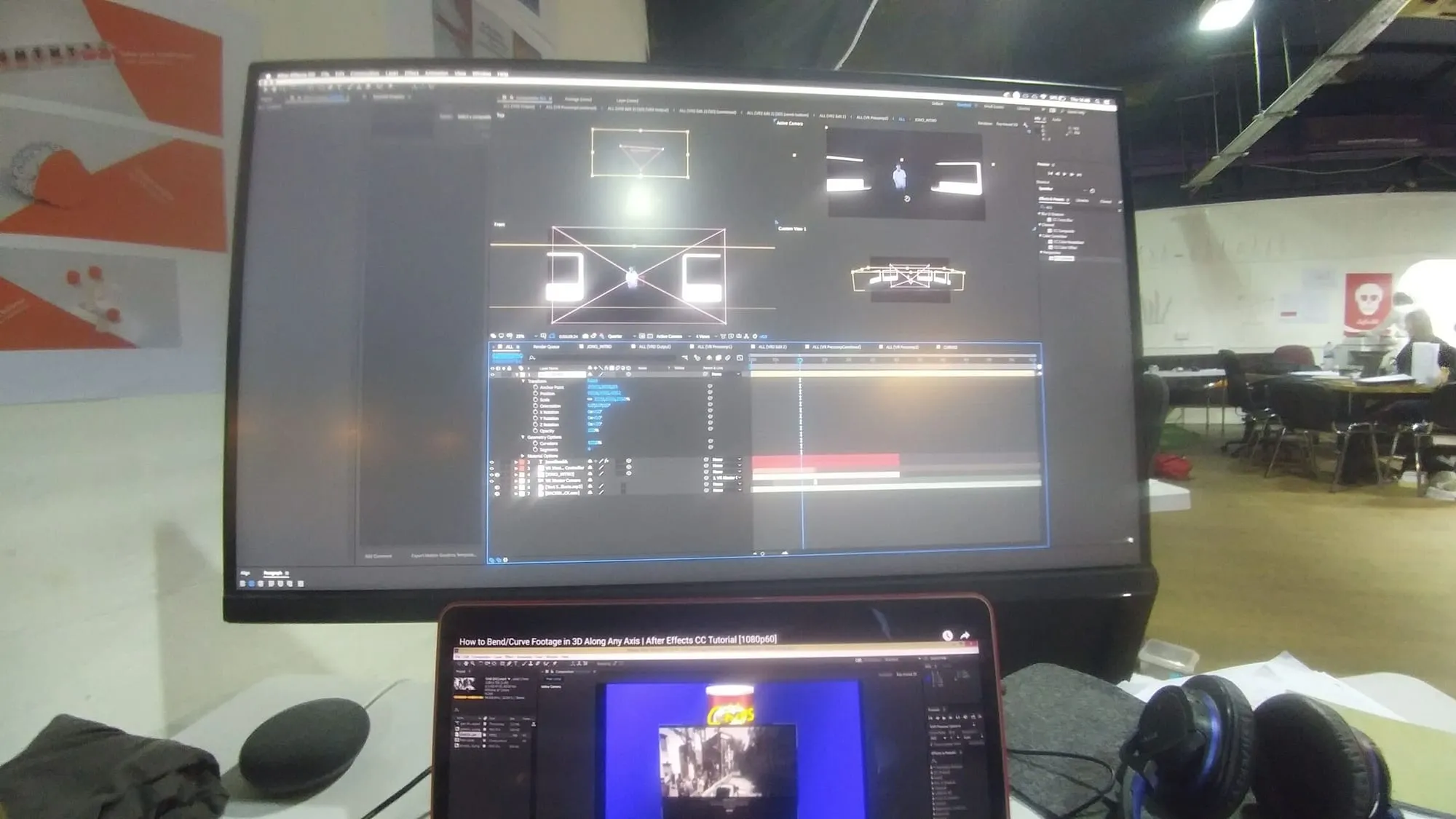
I thought there was an opportunity for more exciting technical build capabilities directly in creative departments of the agencies I was visiting, so I came up with ideas specifically for them and then emailed their senior creatives and developers for feedback.

Designing the VR experience

Once I had ideas that were consistently liked by the agencies I was visiting, I designed a VR experience where a ‘deepfake’ version of me presented them.

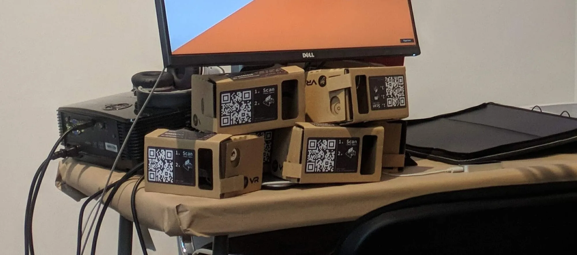
Cardboard VR headsets

Senior creatives thought this was exactly the sort of thing their clients wanted, so I got my job.

Technical skills

What you learn technically will vary depending on where you work, and to what extent you code vs. working with developers — in my role I use the following:

Extended Reality

  • Social AR
    • Effect House — Create interactive AR filters for TikTok
    • Lens Studio — Build AR lenses for Snapchat
    • Spark AR (Instagram, Facebook — now out of support!) — Design AR experiences for Meta platforms
  • Web AR
    • 8th Wall — Platform for browser-based AR experiences
    • WebXR — Web standard for AR/VR in browsers
  • Virtual Reality
    • Unity — Popular engine for VR app development
    • Unreal — High-fidelity engine for immersive VR

Web

We build so many things using web apps — from games to screens in physical installations like this one for HSBC:

Me interacting with the screen at our HSBC Heathrow installation

This is because:

  1. the huge range of APIs and features e.g. WebGL for 3D graphics, WebXR for AR/VR, WebRTC for real-time communication, and WebAudio for interactive sound.

  2. is supported on basically anything with a browser whether that’s a Raspberry Pi, or a super powerful PC

  3. natively supports network-based stuff and updates!

  4. An amazing culture of open source and loads of amazing libraries and communities e.g. Three.js / React Three Fiber, p5.js and others!

We build most of our projects using Next.js (in TypeScript) as we’ve found it the fastest to iterate our projects across front and backend, and the excellent Developer Experience like inclusion of Tailwind for styling, make collaboration that much easier and fun! Oh and because everything is so nicely combined together with Next, vibe coding is a real jam.

We use the following most often:

Design & 3D

Physical tech

Questions

Is this useful? Please let me know.

If you’ve any questions, I aim to get back to all emails within a few days!

Use the contact button above and send me an email :)

Video ·

You can make music videos in PowerPoint

I still don’t know quite why I make them. Perhaps it’s rebellion against presentations, or perhaps just because it’s possible.

The good/bad news is that you can make one too using this nifty tutorial:

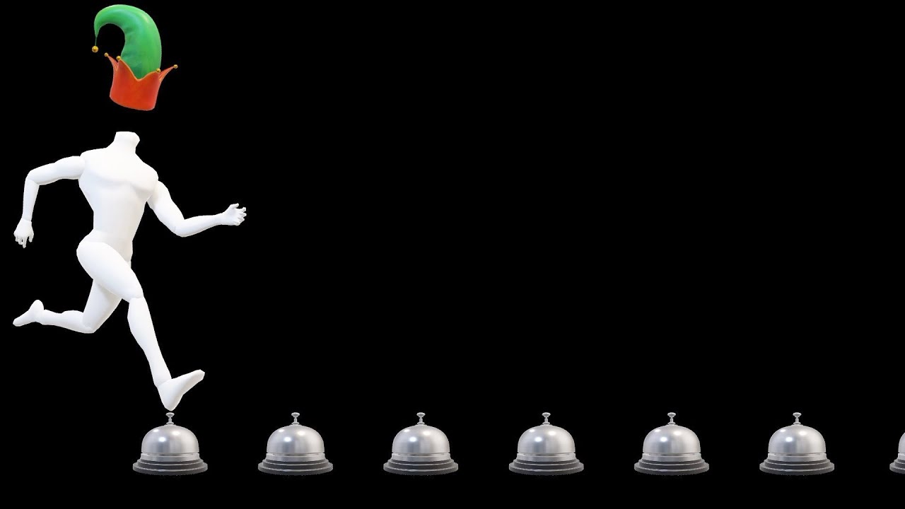
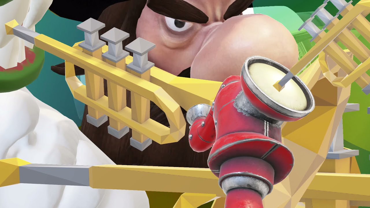
Did you know you could straight up put 3D models into PowerPoint and then animate them?

(Un)surprisingly, these videos have never taken off…

…perhaps because the songs themselves are of little substance, for example involving the landing position of a hat-stand:

…and other astute observations such as the incompatability between coat hangers and sand-castles:

Regardless, this has been a cathartic pursuit for me, and if it encourages just one person to make their presentation 1% more interesting, I’ll consider this a win.

3D prints ·

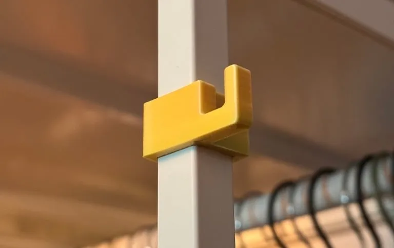
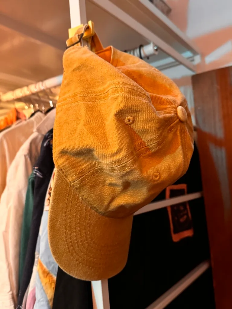
The JONAXEL hook